Fresh paint in the dining room
Hello friends. Today (or tonight, I should say), I wanted to share with you the new paint color in our dining room.
When we first moved into our house – in 2011, I believe – this was the paint on the walls and crown molding …

WAY BEFORE
This precious little lady is now 10 years old, going into 5th grade! Sniff.
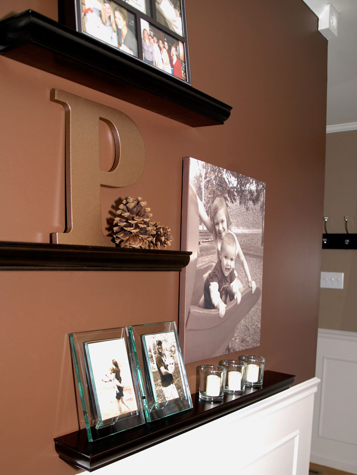
We promptly swapped out that salmon color with a dramatic chocolate brown – Behr’s Cinnabark.

BEFORE

BEFORE
We got more compliments on the paint color in this room than any other in the house. And it truly was a beautiful space, providing rich contrast to the white trim and poor man’s wainscoting. But … I was ready for something fresh, light and new.
So … meet Sherwin Williams Silvermist …


It works well with my thrifty stenciled buffet.

My mother-in-law gave me this vintage wine press, which I filled with spring greens.

I bought the floral canvas wall art for $4 at my local Goodwill. It was new with the tag still on it from HomeGoods. Score!

This neutral blue/green/gray works with my gallery wall, I think.
I chose Sherwin Williams’ flat enamel finish, which provides the most perfect, silky finish that hides imperfections in the walls. But there’s a drawback. It is impossible to clean without leaving marks behind. And for that reason, in the future, I’ll probably stick with my normal Valspar Signature Eggshell finish. Not as silky or forgiving of wall imperfections, but you can wipe it clean, which is a must in our house.

So what do you think of the new wall color? Would you have kept the chocolate brown?
Next week, I’ll be sharing the new paint color in the living room. 🙂


Beautiful color! It gives the look a light, airy feel which I love. Both colors are beautiful! It is hard to choose.
I like the new color. Although the brown is very dramatic and I really liked the contrast, the new color is more current and keeps the room fresh.
I love the brown! So dramatic! But I understand wanting something light and bright for spring/summer and it looks great!
I love the new color! It’s a color I was looking into when we painted the first time. I often use baby wipes to clean up messes on my walls and sometimes Kirkland wipes that have a bit if a rough side for scrubbing.
The gorgeous, sophisticated brown worked better with your table and chairs. This blue is a lovely ethereal color, would go better with a shabby chic looking furniture. Just my opinion, depending what look your going for.
I just painted my living room in Sherwin Williams Repose Gray. I bought it in satin which the paint specialist told me was a similar finish to eggshell in other brands. I LOVE it! I like the new color in your dining room. Change is good!
Very nice look!
Beautiful ! Silvermist is a lovely choice.